


Decorate your home with Original Art
Celebrating the lines, colours & patterns of the natural world
Super Seconds Festival
May 11th-12th
The UK's biggest online seconds and samples sale!
I’m so happy to be taking part in Super Seconds Festival on 11th & 12th May 2024.
Super Seconds Festival is a weekend long online seconds and samples sale featuring 250+ independent makers. The full line up can be seen at www.supersecondsfestival.co.uk from 27th April.


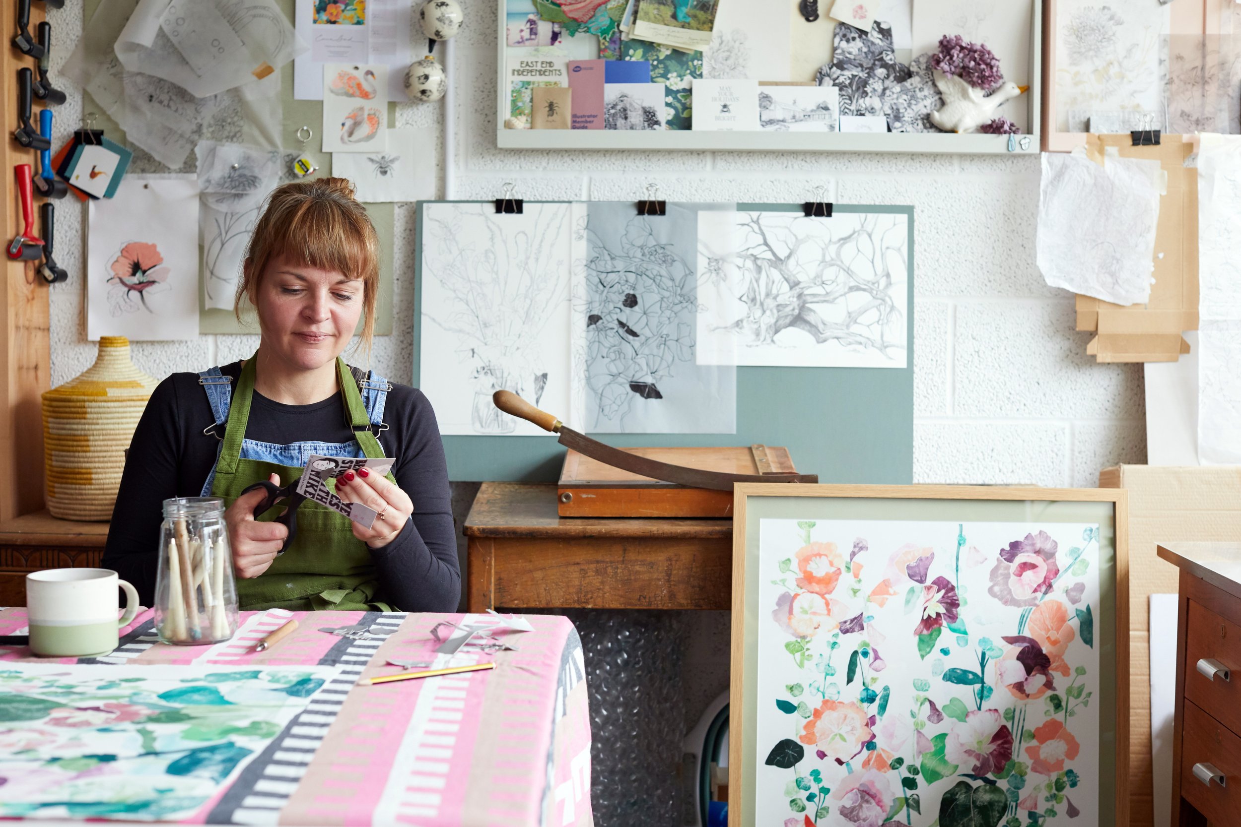
In The Studio
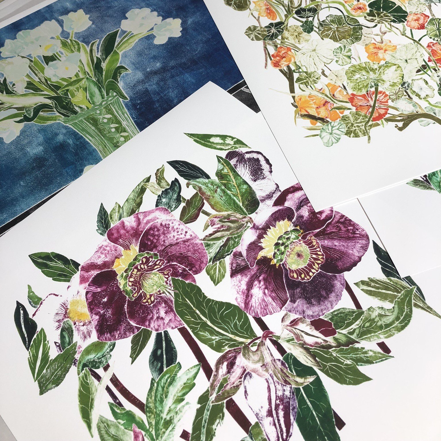
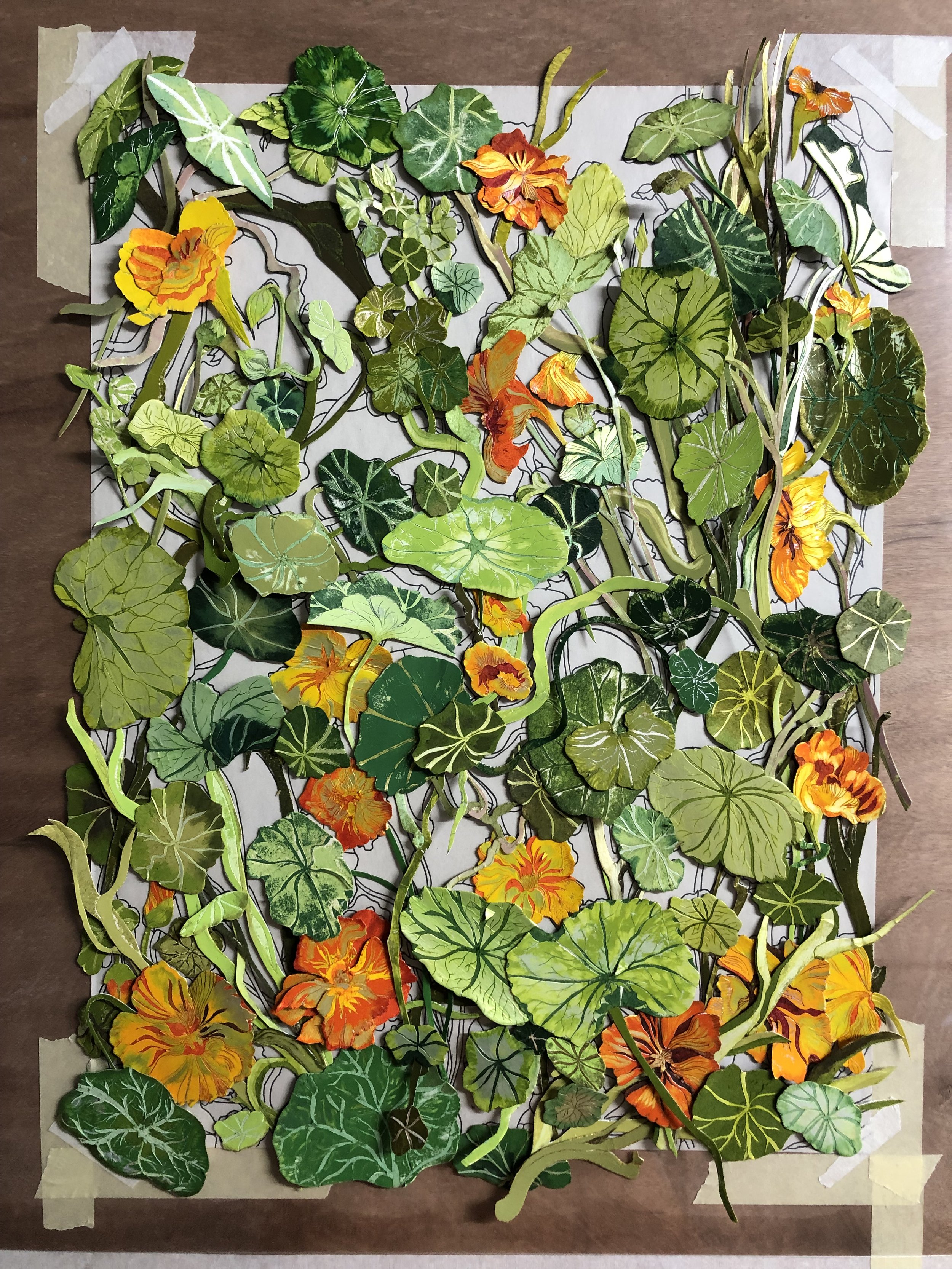
Introducing 'Nasturtiums,' a stunning new print that captures the wild beauty of one of my favourite flowers. I'm obsessed with the way nasturtiums effortlessly intertwine, creating a mesmerizing dance of color and form. Crafting this piece was a challenge, with hundreds of layers intricately composed to do justice to the intricate beauty of the blossoms.
Available soon as a high-quality giclée print to add a punch of vibrant botanical charm to your space.


Pressing Matters
I’m thrilled to share that my work has been featured in Pressing Matters Printmaking magazine. It was a great opportunity to showcase my creative process alongside other talented printmakers. I’m so grateful for the experience and the chance to be part of a diverse printmaking community. Pressing Matters is available to buy here.

Illustration & Printmaking in London.
Hello, I'm Emma, an illustrator and printmaker with a passion for detail.
My work is a reflection of the intricate lines, patterns, and textures found in the natural world.
I specialize in original artwork and print collections, collaborating with brands and licensing my creations. I also run creative workshops so you can unleash your inner artist.
You can find more information on this over on my collaborations and licensing pages.


